It has always been the plan to leverage the brands, equity, expertise and power of both Washington Environmental Council and Washington Conservation Voters into a single, unified brand.
Beginning with a shared lobbyist more than a decade ago, to being led by a single CEO, and including bringing our organizations under one brand in our two most recent strategic plans, the time was perfect to begin this process in 2022.
Communications Director Zachary Pullin was given a huge task: bring WEC and WCV under one brand identity.
In early 2022, Pyramid Communications was selected from a group of 10 agencies from across the country to support the brand project for WEC and WCV. Pyramid took their time in various interviews with current and former board and staff, elected officials, critical stakeholders, funders, volunteers, and programmatic colleagues, in 1:1 interviews, focus groups, and conversations over coffee.
So began our work to understand ourselves from a branding perspective, come together regularly to define who we will be in this new identity, and start reviewing numerous designs and taglines and names from the spring of 2022 to late October 2022.
While it’s easy to read this short background about how we got here, the work was intentional and time consuming.
In November 2022, a small team finalized and approved the new name, Washington Conservation Action (and Washington Conservation Action Education Fund), the logo, and our new tagline.
Changing our names to better reflect our shared vision into a unified brand is the next step in our evolution as organizations. It signals our approach to solving Washington’s most critical environmental issues in a transformational and united way.
While our names are changing, our missions only enhance.
We will still advance environmental policy issues and push for actions that equitably address climate pollution, restore Puget Sound, sustain our state’s forests, and protect our democracy. For this to happen, we cannot rely solely on policy advocacy. We also need environmental champions in elected office. We remain steadfastly committed to supporting Native candidates, candidates of color, and long-time allies—keys to maintaining Washington’s role as a national leader on environmental issues.
Washington Conservation Action and Washington Conservation Action Education Fund share a vision for a Washington state where nature and people live in balance for the flourishing of all. We will still operate with a 501(c3), 501(c4), and Political Action Committee (PAC). As two closely unified organizations, we know we will be more effective in leveraging our suite of powerful tools to advance environmental progress and justice in Washington! Our team is more energized and invigorated than ever before.
Background on name, logo, tagline
The ideal scenario is that when we look at the whole brand as a combo, between name, tagline and logo they combine to convey all of the following: environment, people, future, Washington, and active/action-orientation.
The brand name, Washington Conservation Action, communicates place (Washington), our work (Conservation), and toward movement and action because we generate action statewide on environmental issues. We chose Conservation because of our involvement in the conservation movement and is more inclusive statewide of our work.
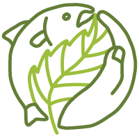
The logo has three elements that communicate about our new brand.
Throughout the process we discussed the symbols and identity components that we wanted to convey. We have a rich visual selection to choose from in the PNW but in particular a couple of pieces stood out:
1) Salmon, an icon of the Pacific Northwest, are culturally significant to the original peoples of this land and also relevant to residents from the Pacific Coast to the Palouse. They also represent persistence (swimming upstream), adaptability (born in freshwater, live in saltwater), and urgency (habitat destruction). Salmon truly represent both our personality and our goals.
2) Leaves & Trees come up frequently when anyone mentions Washington state, however we wanted to share a vision for a united Washington, not separated by political or environmental divides, Evergreens are not a symbol of home for everyone. So we chose the common and humble Alder tree: deciduous, fast growing, and generative. A symbol of restoration and resilience after deforestation or burn. They feed predators and prey alike keeping our ecosystem in forward movement. Their jagged leaves remind us that not all paths are smooth and moving at the speed of trust takes flexibility and accountability.
3) Early in our process, we asked staff to take time outside to respond to the question, “What if Mother Nature was our primary stakeholder, what would our brand look like?” The responses we got were beautifully varied and full of clear passion for our work. Mother Nature is our stakeholder as we interact with nature and reminds us of our interconnectedness. Nature is a gift and we hold a soft, caring hand out to receive it.
With protection and relation inherent in the combination of the three elements together: Salmon, alder leaf, and hand – inseparable cornerstones of life here in the Northwest, working together as one.
And, finally, the tagline. For the first time we’re using a tagline to communicate about our brand. We felt that communicating the “what” that we do would be helpful in our brand identity. We felt “Protecting People and Nature as One” truly conveyed our strategic goals as well as our belief that we are inseparable from nature.
It was Lame Deer who wrote, “…being a living part of the Earth, we cannot harm any part of the Earth without hurting ourselves.” As such, our work recognizes that we are a part of the Earth and we must protect people and nature as one.
Our new website will be live soon at waconservationaction.org. Stay tuned